
Phoenix Mercury Rebrand
The Phoenix Mercury is one of the WNBA’s original teams, but its branding has stayed largely the same since the ’90s. With the league gaining momentum and growing its fanbase, this rebrand was a chance to give the Mercury a bold new look that matches the energy of today’s game. The goal was to modernize the brand while keeping its roots intact—bringing in elements that reflect the team’s legacy, the intensity of the court, and its deep connection to the city of Phoenix. The updated identity feels stronger, more dynamic, and ready to stand out in a new era of women’s basketball.


Problem:
The Phoenix Mercury is one of the few WNBA teams whose branding has remained largely unchanged since the league’s inception in the 1990s. As the WNBA experiences rising popularity, its teams require stronger, more dynamic branding—on par with the NBA—to engage fans and reflect the league’s evolution.
Objective:
This rebrand is an opportunity to build on the team’s existing foundation while introducing new elements that enhance its presence on and off the court. With the aim to modernize and elevate the franchise with a more dynamic and robust branding system—one that reflects their identity, history, and connection to their home city.
Scope of Work
-Brand Identity
-Logo Design
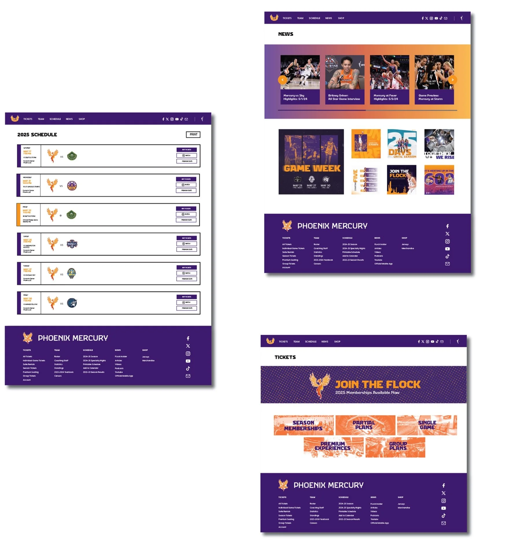
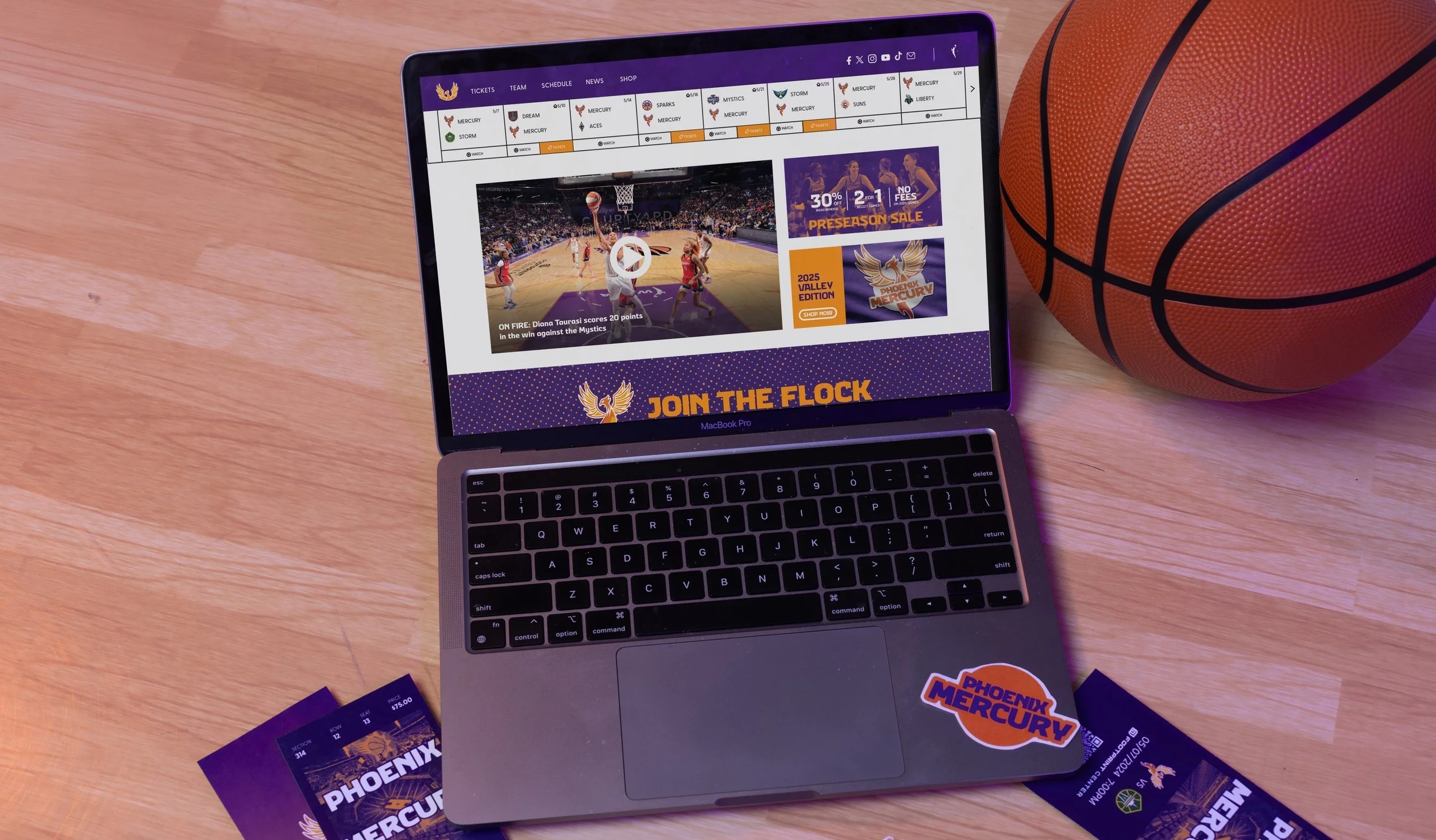
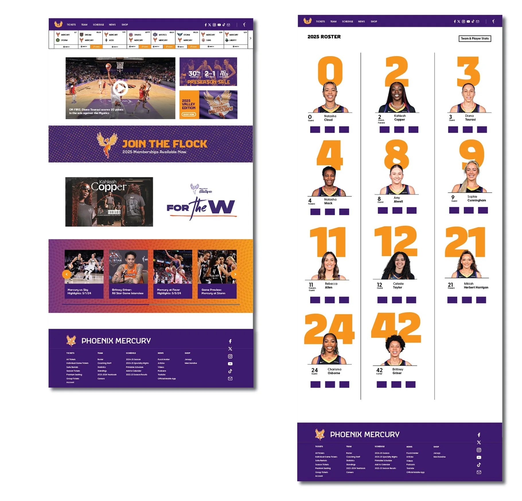
-Web Design
-Social Media Design
-Apparel Design
-Court Design


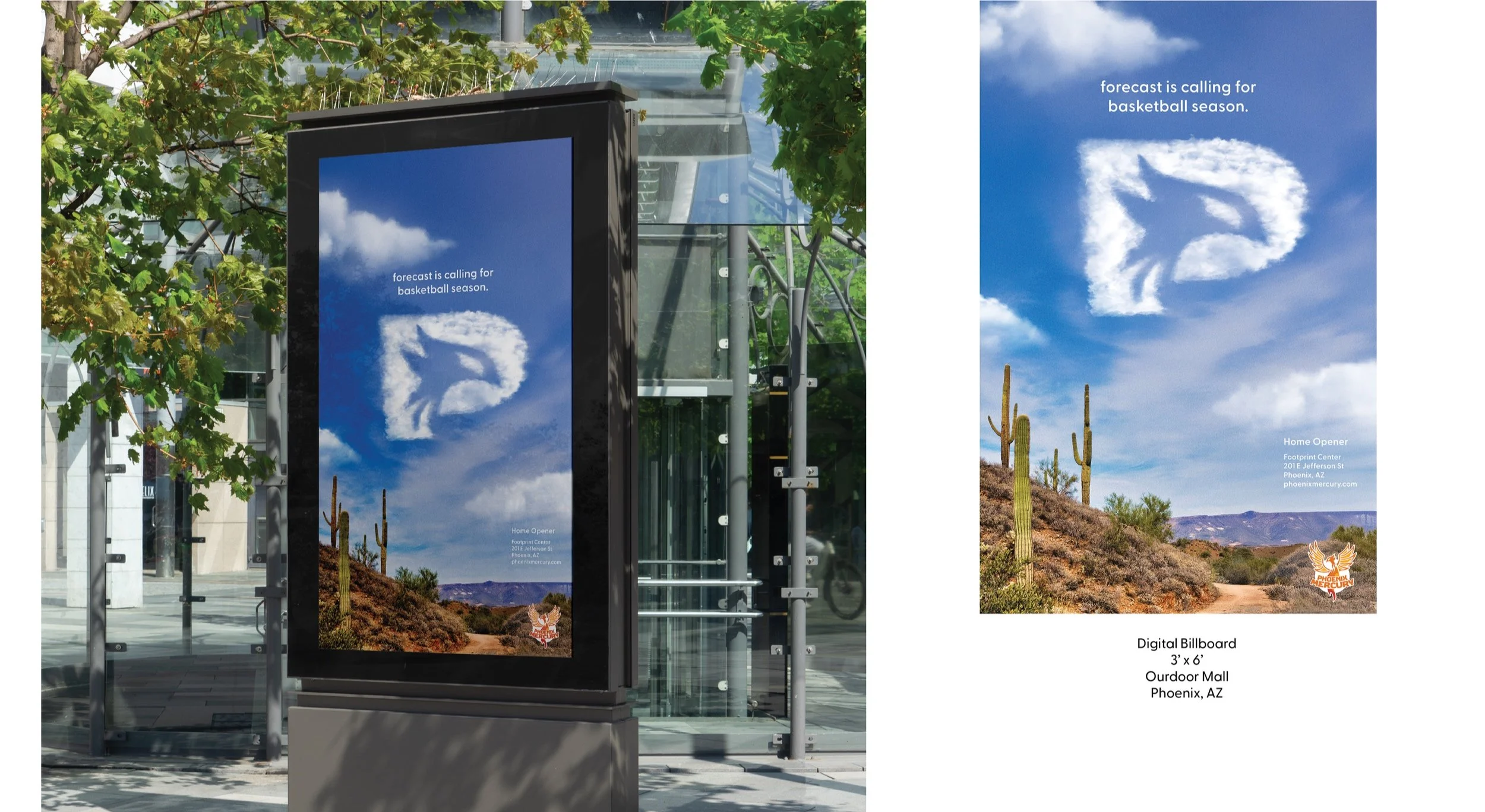
Advertising:
The Phoenix Mercury is one of the few WNBA teams whose branding has remained largely unchanged since the league’s inception in the 1990s. As the WNBA experiences rising popularity, its teams require stronger, more dynamic branding—on par with the NBA—to engage fans and reflect the league’s evolution.